Set Up Storybook with TailwindCSS 4, Twig & Vite
While building this website, a simple portfolio for self-branding and publishing blogs about my learnings, I was pretty much contemplating what stack to use. I initially built a quick prototype with NextJS, but ultimately decided to fallback to Drupal, which I have been using for over a decade now.
During the prototype phase, I tried out TailwindCSS and was quite fascinated by it, so I decided to use it to build the theme. From there, things escalated. I set up Vite, integrated Storybook, and built an atomic design system with Drupal's Single Directory Component.
Is that overkill for a small portfolio website? Absolutely. Was any of it required? Not at all. But, was it fun? Without a doubt!
Now that the site is up, I'll be writing about the things I learned while building the theme, from the how-tos to integrating all the moving parts into a cohesive design, and implementing it seamlessly into a Drupal 11 theme. This post will specifically be about setting up a new project using Vite with TailwindCSS and using it to set up a Storybook to display the components.
Prerequisites
The only prerequisite is to have Node version >= 22 installed locally on the system. I usually prefer to use nvm , which is a version manager for NodeJS. With nvm, I can easily switch between node versions, working on different projects. To install nvm, you can follow the documentation on the GitHub repository of the project
Building a new Drupal theme (partially)
As mentioned, this post will focus on setting up the frontend tooling, which will be completely separate from Drupal for now, so we won't be creating any Drupal-specific files or directories. The goal is to establish a solid foundation using Vite, Storybook, TailwindCSS, & Twig. This setup is Drupal-agnostic and will serve as the base for integrating with a Drupal theme later (in the next post).
Initialise the Project
Start by creating a directory with the name of your choice, and run npm init to initialise a new Node project.
mkdir atlas
cd atlas
npm init -y
Add Storybook with HTML+Vite
To use Storybook to prototype UI components for a Drupal theme, the common integration-friendly choice will be an HTML+Vite template since Drupal themes are typically built with HTML using Twig rendering. Using HTML mode, it will ensure maximum portability of the styles & markup between Storybook and the Drupal theme.
npx storybook@latest init --builder viteThis will set up Storybook with Vite builder and start an instance. When prompted, choose the configuration to install, and choose "Recommended" configuration. For "Do you want to manually choose a Storybook project type to install?" select "Yes" and choose "html" for the list of options.
Once the command finishes, it will start the Storybook instance on the 6006 port (if available), and you can see the default demo components that ship with Storybook. If Storybook doesn't start on its own, you can run npm run storybook to start the instance.
Set Up TailwindCSS 4 with Vite
Install TailwindCSS and the official Vite plugin:
npm install tailwindcss@latest @tailwindcss/vite@latestOnce installed, we need to create and configure Tailwind Styles that will be the entrypoint for the Tailwind CSS to load the utility classes to apply the styles for UI.
Create a CSS file styles/global.css in your project root directory and import Tailwind.
@import "tailwindcss";Add the Tailwind plugins and exports
Firstly, create a Vite config file called vite.config.js which will hold the configurations and will be used to set up customisations. Next, open the vite.config.js file add the below code.
import { defineConfig } from 'vite'
import tailwindcss from '@tailwindcss/vite'

export default defineConfig({
  plugins: [
    tailwindcss()
  ]
})
This will let Vite know about the TailwindCSS plugin and load the utility classes anywhere your CSS is imported.
Integrate Tailwind into Storybook
Now that Tailwind is set up and has an entry point, we need to tell Storybook to load the Tailwind styles. This will be done by importing the global.css file in the preview.js file of Storybook, which will be inside the .storybook directory.
import "../styles/global.css";Now, Storybook will load the Tailwind classes. To test, you can add some Tailwind classes to the default components and verify the styles are getting added.
Note: The Vite configuration file is written using ES module syntax (`import ... from` and `export default`), but Node.js, by default, treats `.js` files as CommonJS. To resolve this, update the package.json file and add "type": "module"
Set up Twig with Storybook
Drupal uses Twig templates to render HTML markup with TwigPHP. But, since Storybook is a JavaScript tool, we need to use a JS equivalent of Twig PHP, which is Twig JS, so that Storybook can compile it.
npm install --save-dev vite-plugin-twig-drupal @modyfi/vite-plugin-yamlThis will install the following packages:
- vite-plugin-twig-drupal: A Vite plugin that is based on Twig JS to compile Twig-based components into JavaScript functions so that they can be used in Storybook and allows Twig files to be imported into stories. It also includes common Drupal Twig filters/functions like
|clean_class,|t, and others to be used in the Twig templates. - @modyfi/vite-plugin-yaml: This will transform a YML file into a JavaScript object so that we can pass data into the stories using YML files.
Update the vite.config.js file to include vite-plugin-twig-drupal and yaml plugin with proper namespace(s) pointing to our components directory. Currently, our components are in the stories directory, but following Drupal's SDC format, we will move our components in components directory.
import { defineConfig } from "vite";
import path from "path";
import twig from "vite-plugin-twig-drupal";
import yml from "@modyfi/vite-plugin-yaml";
import tailwindVitePlugin from "@tailwindcss/vite";

export default defineConfig({
  plugins: [
    tailwindVitePlugin(),
    twig({
      namespaces: {
        components: path.resolve(__dirname, "./components")
      },
    }),
    // Read data from yml files.
    yml()
  ]
});
Configure Storybook
Storybook ships with two main files where all the configurations happens.
- main.js: The main configuration for Storybook server & build process. It defines where your story files are located, typically using glob patterns to find them within your project & manages the registration of Storybook addons to extend Storybook's functionality.
- preview.js: This file is used to display the Storybook components in a preview canvas & allows us to global parameters like screen size, background (light or dark), etc.
As mentioned, we will be building out the componets from a directory called components which follows the Single Directory Component Structure. We also need to tell Storybook to use the vite-plugin-twig-drupal and point to the directory where all the component stories will reside. Update the .storybook/main.js file with the below content.
module.exports = {
  framework: {
    name: "@storybook/html-vite",
    options: {}
  },
  stories: ["../components/**/*.stories.js"], <-- Points to the path where the component stories will reside
  addons: [],
  viteFinal: async config => {
    return config;
  }
};
Create the component directory
If Storybook instance is running, stop the server with Ctrl+C. Create a directory called components which will hold the UI components to be displayed in Storybook and eventually in our Drupal theme. Since, we won't need the default stories directory, it can be deleted safely.
Creating a Component
With the current set up, we can start building out components. To keep things simple, let's create a simple "Button" component with variantions.
- Create a directory called "button" inside the components directory.
- Create the below files in the button components
- button.twig
- button.stories.js
- button.data.yml
In the example, we will create a button component with three variations viz, "primary" & "secondary"
button.twig
{#
  Set the `theme` variable to 'primary' by default if it's not explicitly passed in via args/context.
#}
{% set theme = theme|default('primary') %}

{#
  Define a map of theme variants to corresponding Tailwind CSS background color classes.
  This allows switching themes dynamically using a variable such as `theme = 'primary'`.
#}
{% set theme_classes = {
  primary: 'bg-blue-800 hover:bg-blue-900',
  secondary: 'bg-gray-700 hover:bg-gray-900'
} %}

{#
  Define the base button classes as an array.
  These include padding, typography, border, and rounded corners.
  Also append the background color class from `theme_classes[theme]`.
#}
{% set classes = [
  'button',
  'px-4',
  'py-2',
  'font-bold',
  'text-sm',
  'border',
  'text-white',
  'rounded-full',
  'cursor-pointer',
  'transition-all',
  'duration-200',
  theme_classes[theme]
] %}

{#
  Create a `button_attributes` object and add all the predefined classes to it.
  This enables clean and flexible attribute/rendering control.
#}
{% set button_attributes = create_attribute().addClass(classes) %}

{#
  Render the button with dynamic classes applied via `button_attributes`.
  Use `label` as button text with a fallback to 'Button' if not defined.
#}
<button {{ button_attributes }}>
  {{ label|default('Button') }}
</button>
button.data.yml
label: Learn More
theme: primary
button.stories.js
/**
 * First, we will import the component template twig file. If the the component
 * relies on additional files like js or css files those can be import here.
 */
import buttonTemplate from "./button.twig";

/**
 * Import data (e.g., label, theme) from a YAML file to use as default args in
 * Storybook
 */
import data from "./button.data.yml";

export default {
  /**
   * Group this component under the “Atoms” section in the Storybook sidebar.
   * This will be useful to display the components in an atomic structure by
   * grouping the components like Atoms, Molecules, Organism, etc.
   */
  title: "Atoms/Button",

  /**
   * Use the imported `data` as default props (args) for the component.
   */
  args: data,

  /**
   * Define interactive controls in Storybook’s “Controls” panel.
   */
  argTypes: {
	label: {
      control: "text",
      description: "Text inside the button"
    },
    theme: {
      control: { type: "select" },
      options: ["primary", "secondary"],
      description: "Visual theme variant for the button",
      table: { defaultValue: { summary: data.theme } }
    }
    // You could add more controls. Undefined controls will be displayed as text
    // by default.
  }
};

/**
 * Basic "Primary" variant using the default args.
 */
export const Primary = args => buttonTemplate(args);
Start the Storybook server:
npm run storybookWith the Storybook server running, the button component will be rendered in the instance, as shown below:
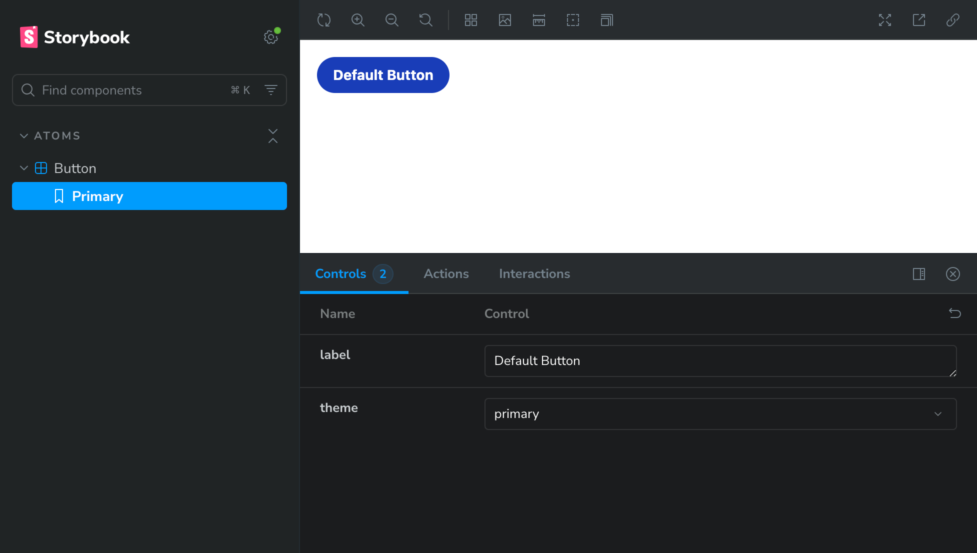
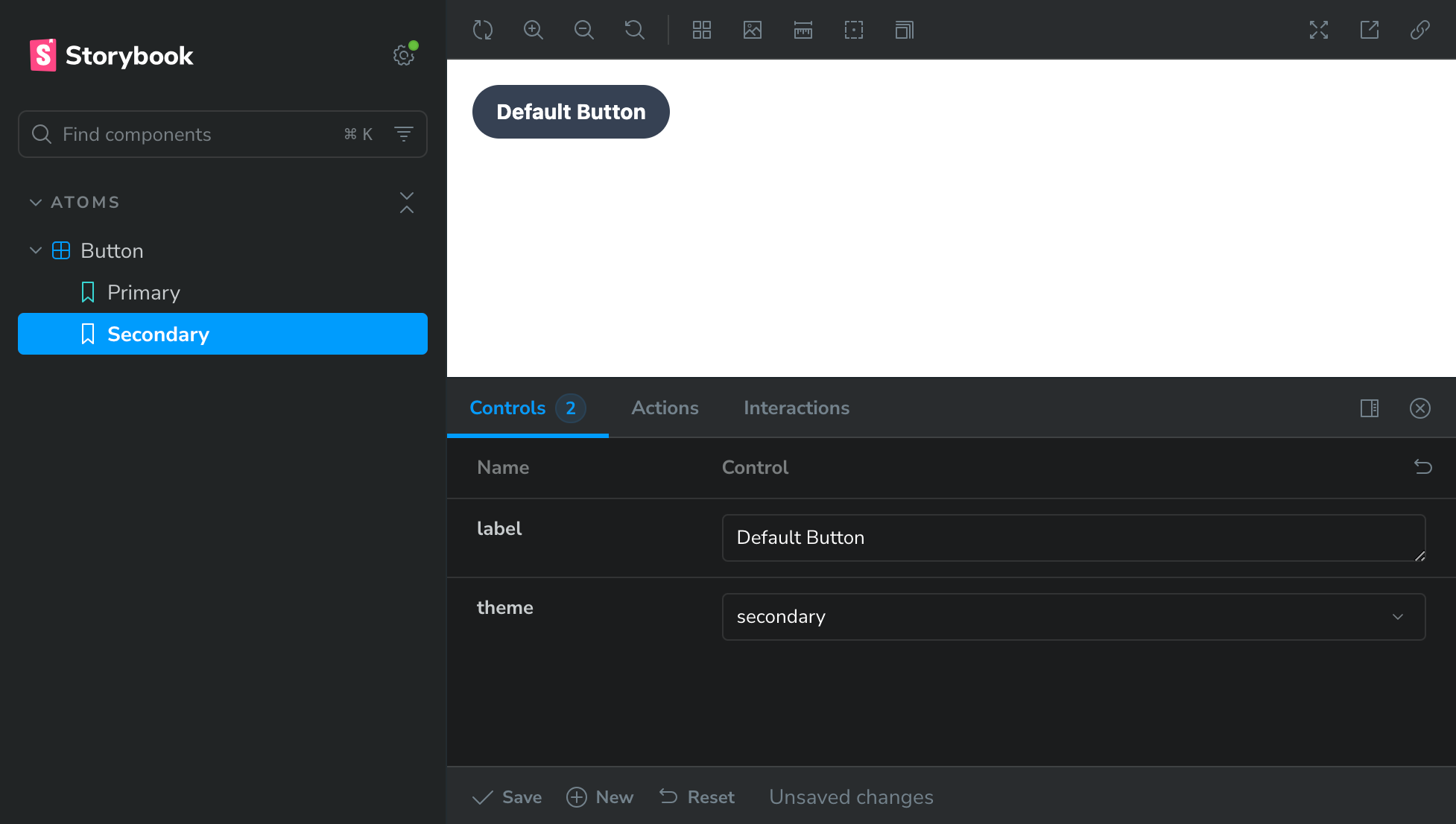
With the controls at the bottom, we can change the theme of the "button" component to see the Primary & the Secondary variant. If you want to display the Secondary variation as well under the Button component in the Storybook preview, update the button.stories.js files with the below code at the bottom of the file.
/**
 * "Secondary" variant with the `theme` arg overridden to 'secondary'.
 */
export const Secondary = args =>
  buttonTemplate({ ...args, theme: "secondary" });
This is show the Secondary variantion as well in the Storybook preview.
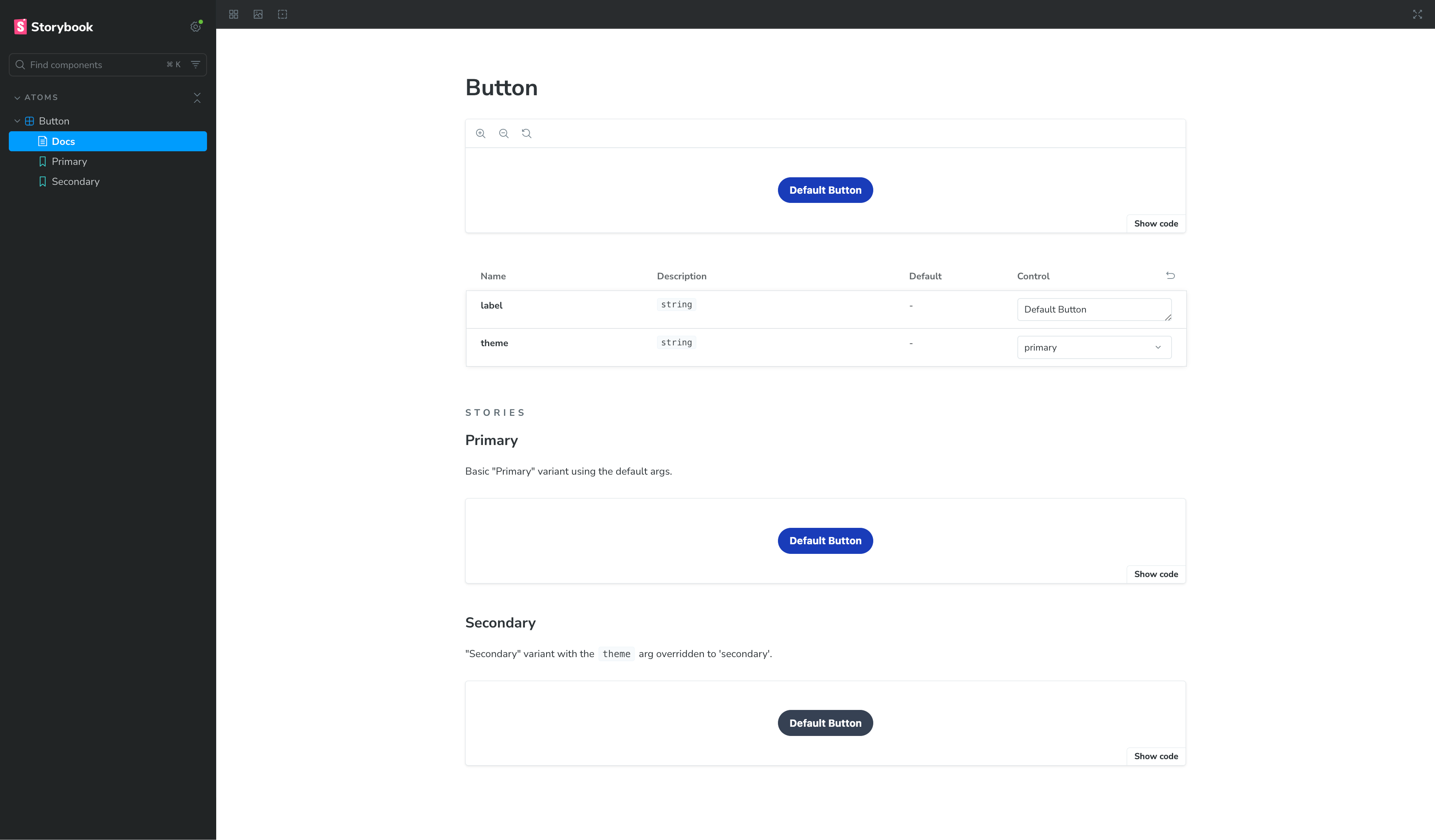
AutoDocs in Storybook
Storybook Autodocs is a powerful feature that generates documentation for the components without the need to write them separately in a Markdown or MDX file. It reads the component.stories.js file, their arguments (args), controls & JSDoc when available, and builds a documents page in the Component. Since these docs live in the code, it is always updated and there is no risk of getting the documentation being outdated.
To enable the autodocs feature, we need the @storybook/addon-docs plugin to be added in .storybook/main.js
/**
* Add the `@storybook/addon-docs` plugin in the addons section in the main.js file.
*/
...
addons: ["@storybook/addon-docs"],
...
Next, update the .strobook/preview.js to enable autodocs
import "../styles/global.css";

export default {
  parameters: {
    layout: "centered"
  },
  tags: ["autodocs"]
};
Stop the Storybook instance, and restart it. Once it is up, you can see the Button component documentation in the Storybook preview window as shown below
Wrapping Up
The Button component, although simple, demonstrates how to utilise plugins & tools to display a component in a Storybook environment using TailwindCSS and Twig, all powered by Vite. However, the process of building a more complex component will remain the same.
In the next post, we'll take this a step further and convert the button into a full SDC (Single Directory Component). Then build a "Teaser" component using an atomic design approach, and finally integrate it with an Article content teaser view mode.
I hope this post was useful, and if you're setting up Storybook with TailwindCSS & Twig and need a hand, feel free to reach out. Happy to help.