From Storybook to Drupal: Building Reusable Components with SDC
In the previous post, I walked through building a component with Twig and TailwindCSS, wiring it up with Vite, and previewing it in Storybook. We created a simple Button component with variants and used Storybook to see how it renders in isolation.
Now let’s take it a step further. This time, we’ll move toward an atomic design approach, breaking things into smaller components and composing them into something more meaningful. The goal is to stitch these pieces together into a larger component that renders an Article in a teaser view mode.
Why Single Directory Components (SDC) matter?
Single Directory Components (SDC) change how frontend development is approached in Drupal. Instead of scattering templates, styles, and scripts across different places, SDC keeps everything a component needs in one directory. That simple shift makes components easier to reuse, reason about, and maintain over time.
It also encourages cleaner structure. Each component becomes a self-contained unit with a clear responsibility, which reduces accidental coupling and makes collaboration smoother. You can work on a component in isolation, but still plug it into larger builds without friction.
Component-based development isn’t new to Drupal. Earlier solutions like the Components module solved this, but they came with setup overhead and weren’t part of core. SDC changes that. It brings a native, zero-configuration approach into Drupal core that works out of the box, making modern component-driven development feel natural instead of bolted on.
Converting a Storybook Component to an SDC
SDC follows a simple convention: every component lives inside a components directory, with everything it needs colocated. Since the Storybook is already pointing to that directory managed via the Storybook config in main.js, we’re most of the way there. The remaining step is to make the component discoverable to Drupal by adding a component.yml file.
This file acts as the contract for the component. It defines metadata, documents how the component should be used, and formally describes its inputs through props and slots. Think of it as the bridge between the frontend setup and Drupal’s rendering system.
Here’s a component.yml for the button component:
$schema: https://git.drupalcode.org/project/drupal/-/raw/11.x/core/assets/schemas/v1/metadata.schema.json
name: Button
description: Reusable button component with theme variants.

props:
	type: object
	properties:
		label:
			type: string
			title: Label
			description: Text displayed inside the button element.
			default: Button
			examples:
				- Learn more

		theme:
			type: string
			title: Theme
			description: Visual theme variant used for styling classes.
			default: primary
			enum:
				- primary
				- secondary
What this adds:
- schema: SDC metadata schema used by Drupal to validate component definition
- name: Human readable component name
- props: Input API of the component available to Twig
We can also add slots which opens the door for more advanced composition when props aren't enough
Once this file is in place, the Storybook component isn't just a preview anymore. It becomes a first-class Drupal component, ready to be reused across templates, view modes, and even other components
Building a Teaser component
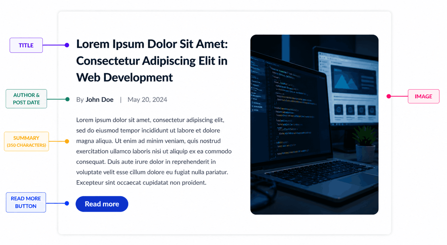
Let’s build a teaser component that shows a compact preview of an Article.
It typically includes a heading, an image, a short summary, and a “Read more” button. You can also add meta details like author and publish date.
From an SDC point of view, this is where composition shines. Instead of one big template, you combine smaller components like a heading, an image, and a button into a reusable teaser.
Based on the image above, start by creating a Storybook entry to register it, so we can preview and test it in isolation.
To create the teaser component, create a new folder called "teaser" with the below structure
- teaser.data.yml - The data file for the Storybook component
- teaser.twig - The teaser template
- teaser.stories.js - Storybook registry
teaser.data.yml
title: "Lorem Ipsum Dolor Sit Amet: Consectetur Adipiscing Elit in Web Development"
link: "/stories/archive"
image: >-
  <img
    src="https://picsum.photos/640/360?grayscale"
    alt="Sample teaser image"
    class="h-full w-full object-cover transition-transform duration-300 group-hover:scale-105"
  />
meta: "Feature story"
summary: "Lorem ipsum dolor sit amet, consectetur adipiscing elit, sed do eiusmod tempor incididunt ut labore et dolore magna aliqua. Ut enim ad minim veniam, quis nostrud exercitation ullamco laboris nisi ut aliquip ex ea commodo consequat. Duis aute irure dolor in reprehenderit."
Here is the template to render the twig file
<article class="teaser teaser--card max-w-4xl mx-auto p-6 bg-white rounded-xl shadow-sm">
  <div class="teaser__layout flex flex-reverse flex-wrap gap-6 items-start">
    <div class="teaser__content flex-1">
      <h2 class="teaser__title text-2xl font-semibold text-gray-900 leading-snug mb-2">
        {{ title}}
      </h2>

      <div class="teaser__meta text-sm text-gray-500 mb-3">
        {% block meta %}
          {{ meta }}
        {% endblock %}
      </div>

      <div class="teaser__summary text-sm text-gray-600 leading-relaxed mb-4">
        {{ summary }}
      </div>

      <a href="{{ link }}" class="teaser__link inline-block px-5 py-2 text-sm font-medium text-white bg-blue-700 rounded-full hover:bg-blue-800 transition">
        {{' Read More'|t }}
      </a>
    </div>

    <div class="teaser__image w-40 rounded-lg overflow-hidden flex-shrink-0">
      {% block image %}
        {{ image }}
      {% endblock %}
    </div>

  </div>
</article>
The image and meta variables are currently wrapped inside Twig block statements. These will be explained later when we cover the Drupal integration.
teaser.stories.js
import teaserTemplate from "./teaser.twig";
import data from "./teaser.data.yml";

export default {
  title: "Molecules/Teaser",
  args: data,
  argTypes: {
    title: {
      control: "text",
      description: "Heading text displayed for the teaser"
    },
    link: {
      control: "text",
      description: "URL applied to the teaser wrapper link"
    },
    image: {
      control: "text",
      description: "HTML content used as the Image slot in Storybook"
    },
    meta: {
      control: "text",
      description: "HTML or text content used as the Meta slot in Storybook"
    },
    summary: {
      control: "text",
      description: "Short body text displayed below the title"
    }
  }
};

export const Default = args => teaserTemplate(args);
Once the files are set up, run the Storybook server - npm run storybook and navigate to the teaser component to view the component in Storybook
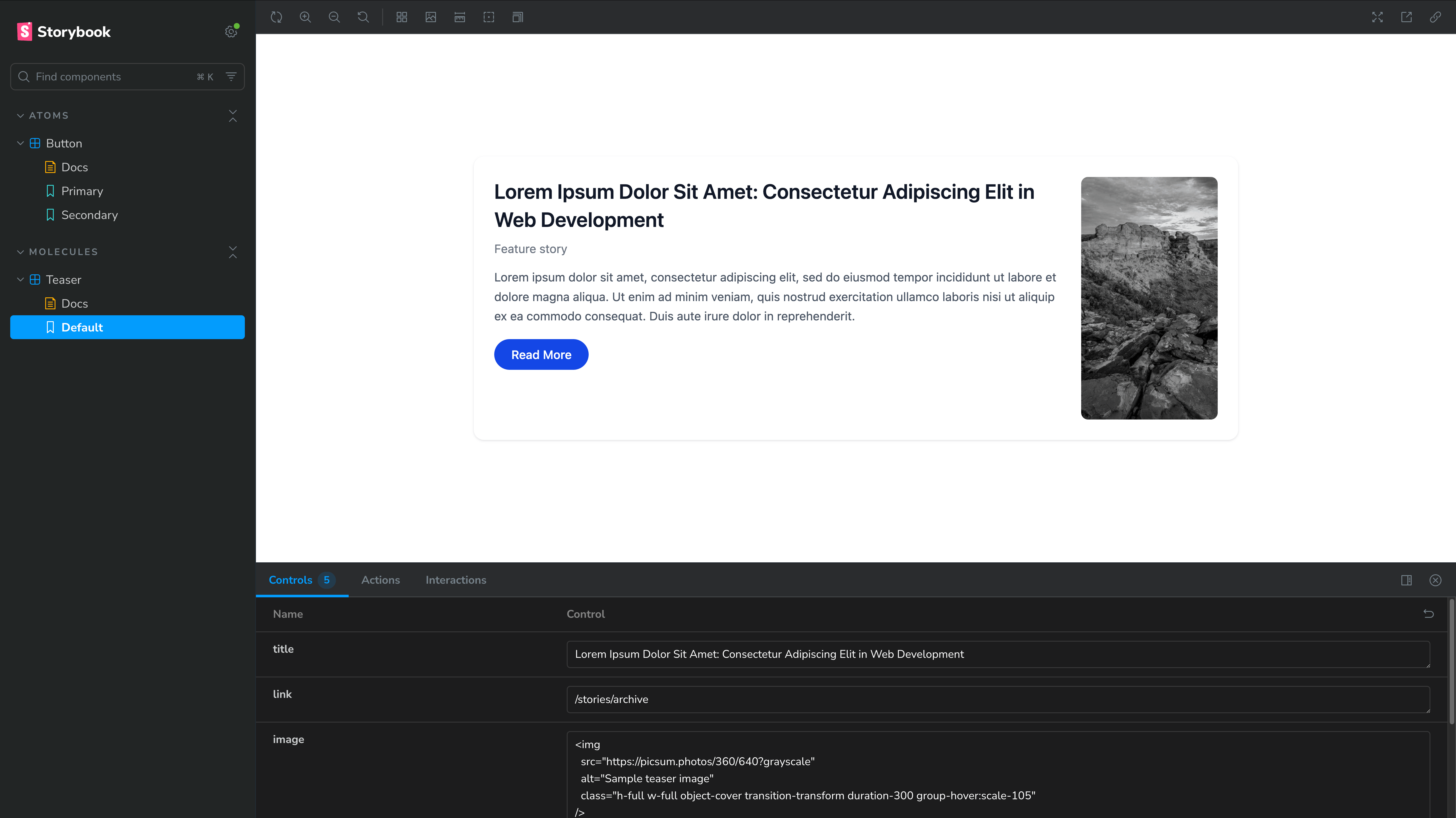
Integrating the Teaser component with Drupal
To use your Storybook component in Drupal, you need to convert it into a Single Directory Component (SDC). This is done by adding a component.yml file inside the component’s folder.
In this case, create a file named teaser.component.yml inside the teaser directory. This file will define how Drupal understands and renders the component, allowing it to be used for different elements on your site.
# SDC metadata schema used by Drupal to validate component definitions.
$schema: https://git.drupalcode.org/project/drupal/-/raw/11.x/core/assets/schemas/v1/metadata.schema.json

# Human-readable component name shown in tooling and docs.
name: Teaser

# Short summary of the component's purpose and behavior.
description: Reusable teaser card with title and optional image and meta slots.

# Input API for this component (props available to Twig).
props:
	type: object
	properties:
		title:
			type: string
			title: Title
			description: Heading text displayed for the teaser.
			default: Teaser title
			examples:
				- Stories from the archive

		link:
			type: string
			title: Link
			description: URL applied to the teaser link wrapper.
			default: '#'
			examples:
				- /stories/archive

		summary:
			type: string
			title: Summary
			description: Short body text displayed below the title.
			default: ''
			examples:
				- A short description of the article goes here.

# Named content areas rendered via Twig blocks.
slots:
	image:
		title: Image
		description: Visual media displayed at the top of the teaser.

	meta:
		title: Meta
		description: Supplementary metadata displayed above the title.
The meta and image are wrapped in Twig block statements, which act as SDC slots. This gives you flexibility to control what gets rendered without changing the component itself.
For example, in the meta section, you might show just the publish date, or include category and author as well. Since it’s a slot, you can adjust this at usage time instead of modifying the component.
The same applies to images. Using a slot here is a better approach, especially when dealing with responsive image styles. Passing all variations as props would get messy and tightly couple the component to configuration details. With slots, you keep the component clean and let Drupal handle things like image styles and rendering.
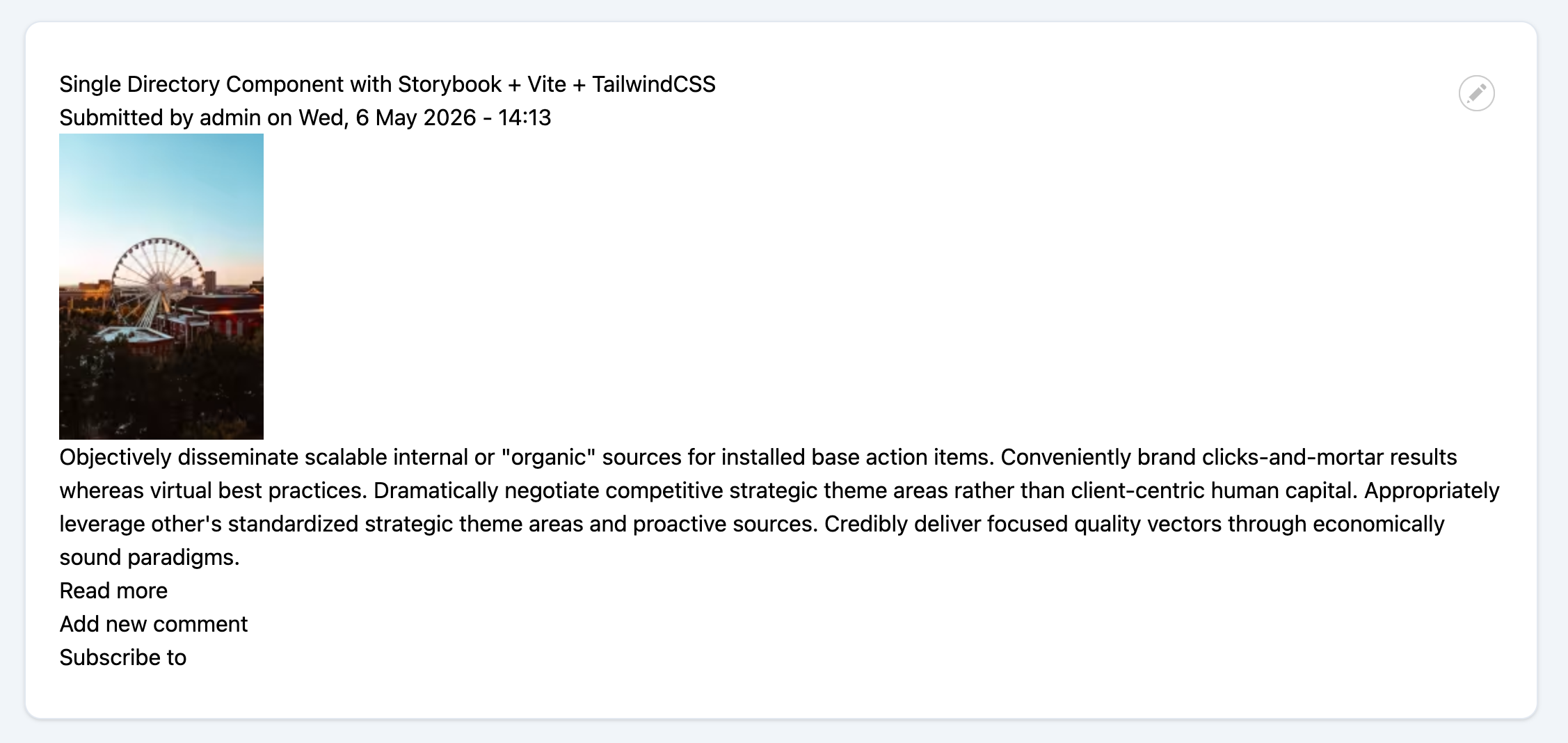
Set up Article teaser view mode
Next comes the Drupal integration, where the Storybook component is used in a real scenario.
The default Article content type in Drupal 11 will be used, along with its Teaser view mode. Minor configuration updates were made to the Teaser view mode of Article content - the image style for the Image field was set to Large (480×480) - for this demonstration. The only other requirement is a custom theme, set up in the same directory as the Storybook components.
Below is an example of a basic, unstyled Teaser view mode for an Article.
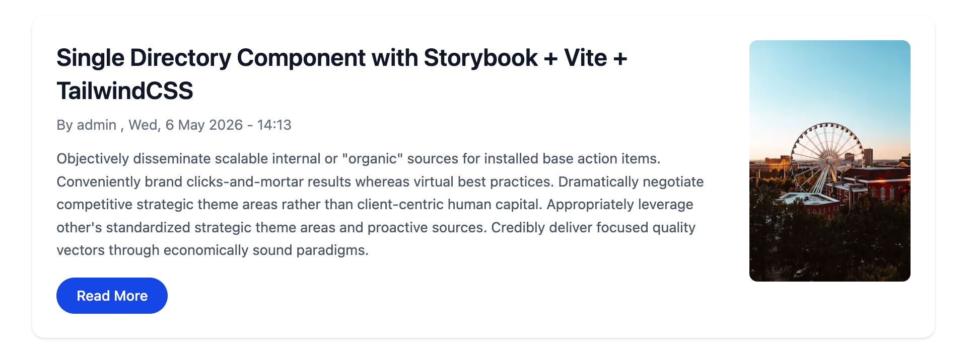
Integrating the Teaser component with Drupal
Next, the Storybook component, now converted into a Single Directory Component, will be integrated with Drupal templates.
The template used for this integration targets the Teaser view of the Article content type: theme_name/templates/content/node--article--teaser.html.twig. This template controls how the teaser version of an Article is rendered and is where the component will be applied.
{% embed "atlas:teaser" with {
    title: label,
    link: url,
    summary: content.body,
} %}

  {% block meta %}
    {{ 'By'|t }} <span class="author">{{- author_name -}}</span>, {{ date }}
  {% endblock %}

  {% block image %}
    {{ content.field_image }}
  {% endblock %}

{% endembed %}
In the template above, the teaser component is integrated using the Twig embed tag. The title, link, and summary properties are passed to the component, while the meta and image slots are used to render the author details and image fields.
This setup allows the component to stay flexible and reusable, while keeping the template clean and easy to manage.
Conclusion
Bringing everything together, the journey moves from a simple, isolated Storybook component to a fully integrated Drupal experience powered by Single Directory Components. What starts as a UI exercise evolves into a structured, reusable system that fits naturally into Drupal’s rendering layer.
By combining Storybook for development, SDC for organization, and Twig for integration, components become more than just visual pieces; they turn into reliable building blocks that can be reused across templates, view modes, and future features. The teaser example highlights this shift clearly: smaller pieces working together to form something meaningful, without adding complexity.
This approach not only keeps code cleaner but also makes it easier to scale. New components can be added, existing ones can be improved, and everything remains predictable and maintainable.
From here, the same pattern can be extended to more complex components, richer layouts, and complete design systems.
Modern Drupal theming doesn’t have to feel fragmented. With SDC, it becomes structured, flexible, and built to grow.